
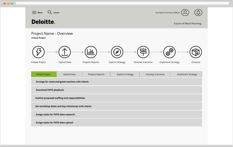
Re-envisioning and modernizing the Future of Talent Optimization application to improve usability and enhance feature sets for better consulting engagements.

FOTO is acronym for Future Of Talent Optimization, an important tool originally designed by a team in the United Kingdom and used by a consulting team out of Toronto Canada to enable consultants to help clients visualize the fundamental structure of their organizations and how those organizations can be optimized via disruption across an array of dimensions. When we acquired this tool is was operational but complex and wasn’t a particularly easy to use from a consulting perspective. Visualizations were limited and not easy for users to understand at at glance.
 Gretchen Kowalski is a leader for her company’s workforce. She's unsure what trends are leading in her industry and how to stay cutting edge. Her pain points include:
 Aaron Moles is a senior manager for Deloitte focused on leveraging the FOTO tool to sell future engagements to clients. His pain points include:
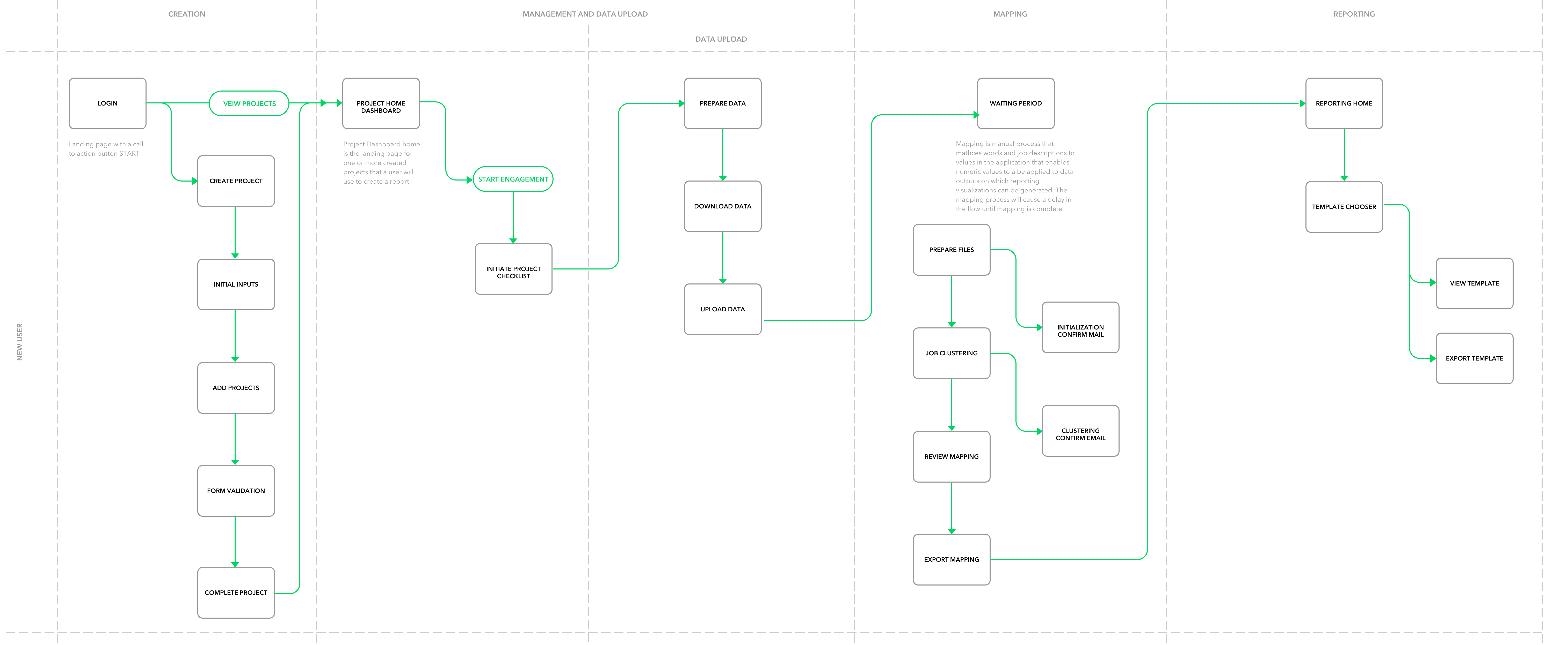
Phase one of this project was to acquire and fully analyze how this tool actually worked. A series of meetings and demos with both the UK and Canadian teams were required to accomplish this. As no complete documentation or flows existed I developed a flow diagram to help the team better understand the process. The tool worked as follows: an account was established and a specific project is created for company. Data and job rolls collected from survey information are mapped to O*NET job roles. This data could then be used to create data models and visualizations to reveal insights about workplace disruption potential.
The inherited codebase was built in the .NET framework. Due to the deprecation of .NET one of the first things that needed to be done was a code migration off of .NET on to the LAMP stack.
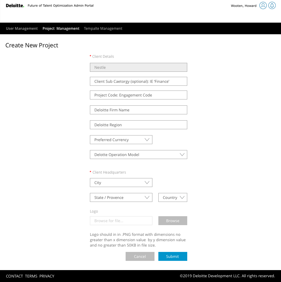
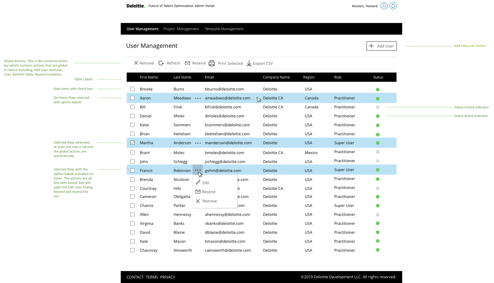
This also meant some aspects of application needed to be redesigned as a part of that process. One such aspect was the user management portal which allowed super admins to add, remove, and grant certain permissions to users.
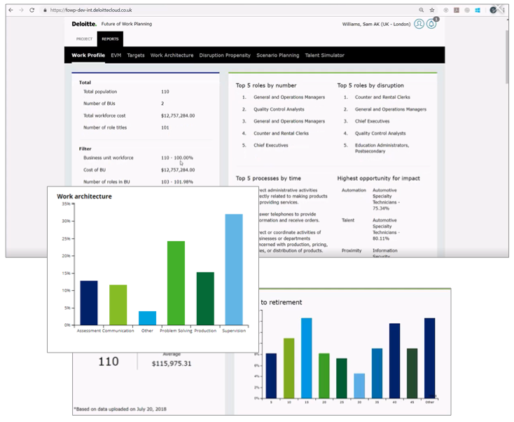
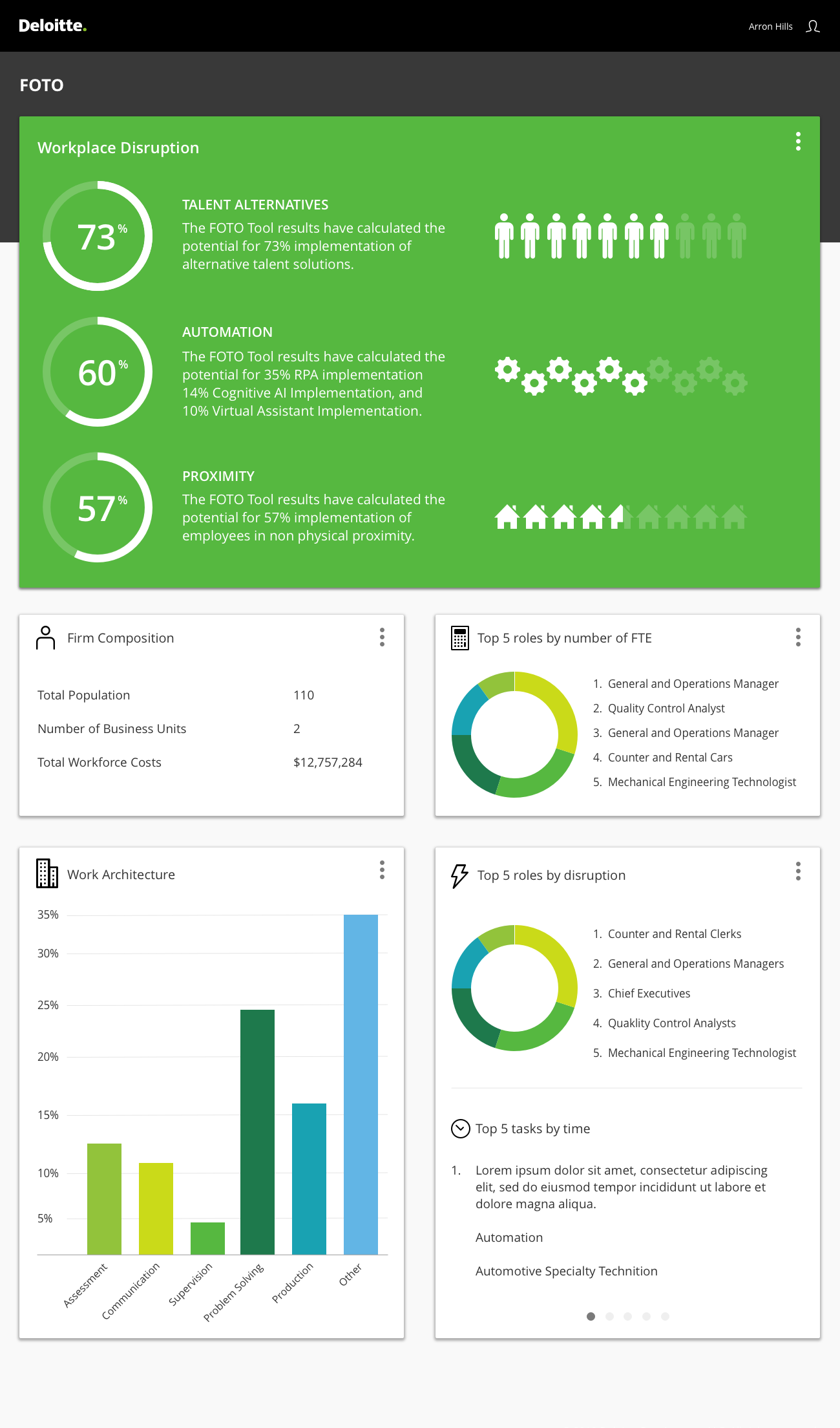
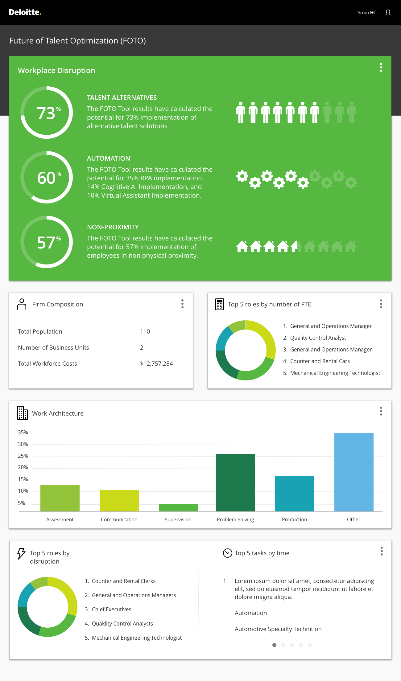
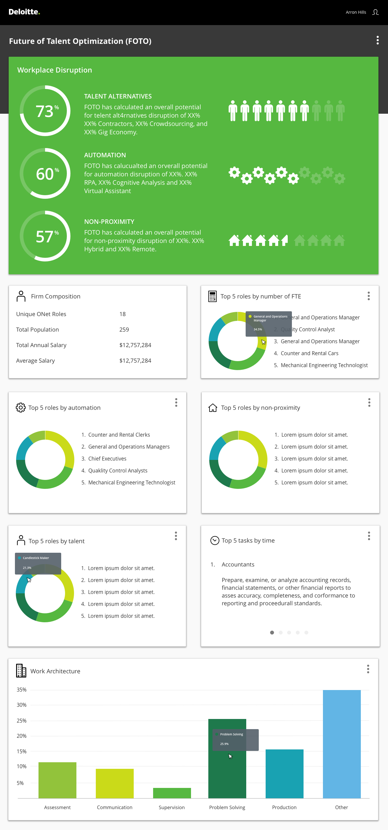
This project was a bit backward. I wanted to focus on the framework but the business was more concerned with modernizing the data visualizations first to show immediate progress. The tool had been universally criticized for having unattractive and difficult to understand visualizations. Addressing them sooner rather than later could be advantageous to the organization for business reasons.
Top five was our first foray into creating a new set of reporting templates in a new visual language. After building a mood board and getting a sense for trends in modern responsive dashboard design I created a number of configurations for review.
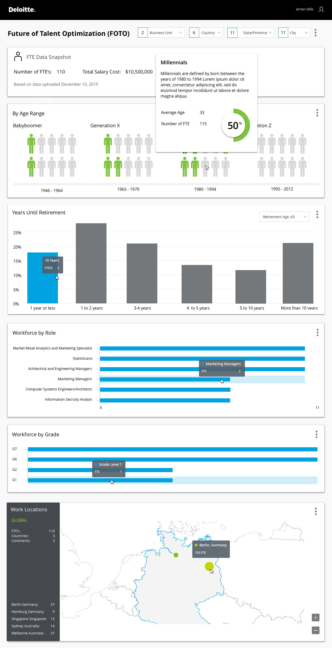
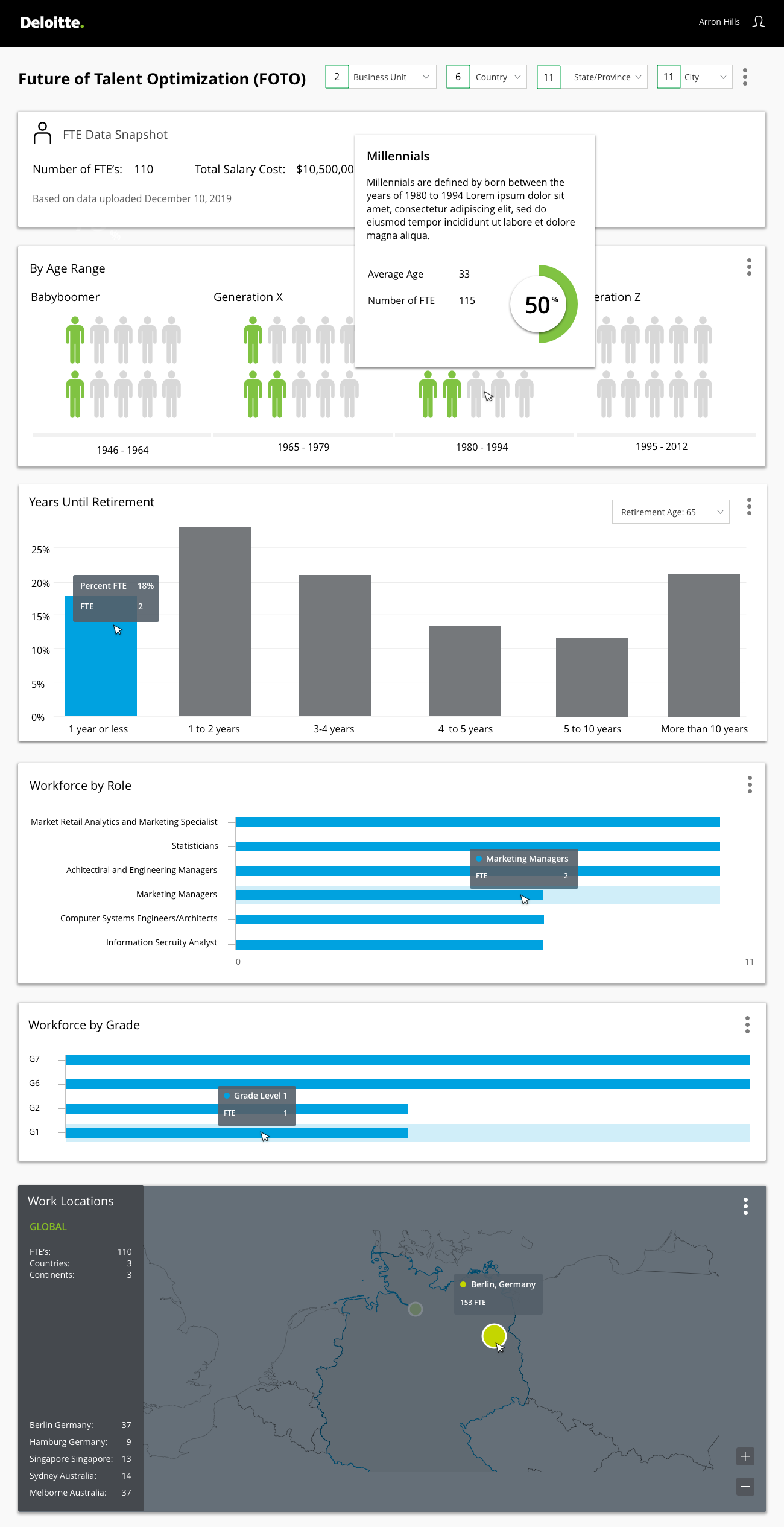
The original workplace profiles template was bland and restricted in functionality and data. The new template needed to show clear and obvious visualizations to support workplace demographic insights.
As the various modules were being designed the PM felt there was a lack of clear visualizations for a snapshot of how the workplace demographic was comprised. I designed a series of modules to address this lacking need. After this came the requirement to greatly expand the scope and function of the mapping solution. To achieve this I introduced the concept of nested blades that would show global and city specific data based on hover/click interactions.
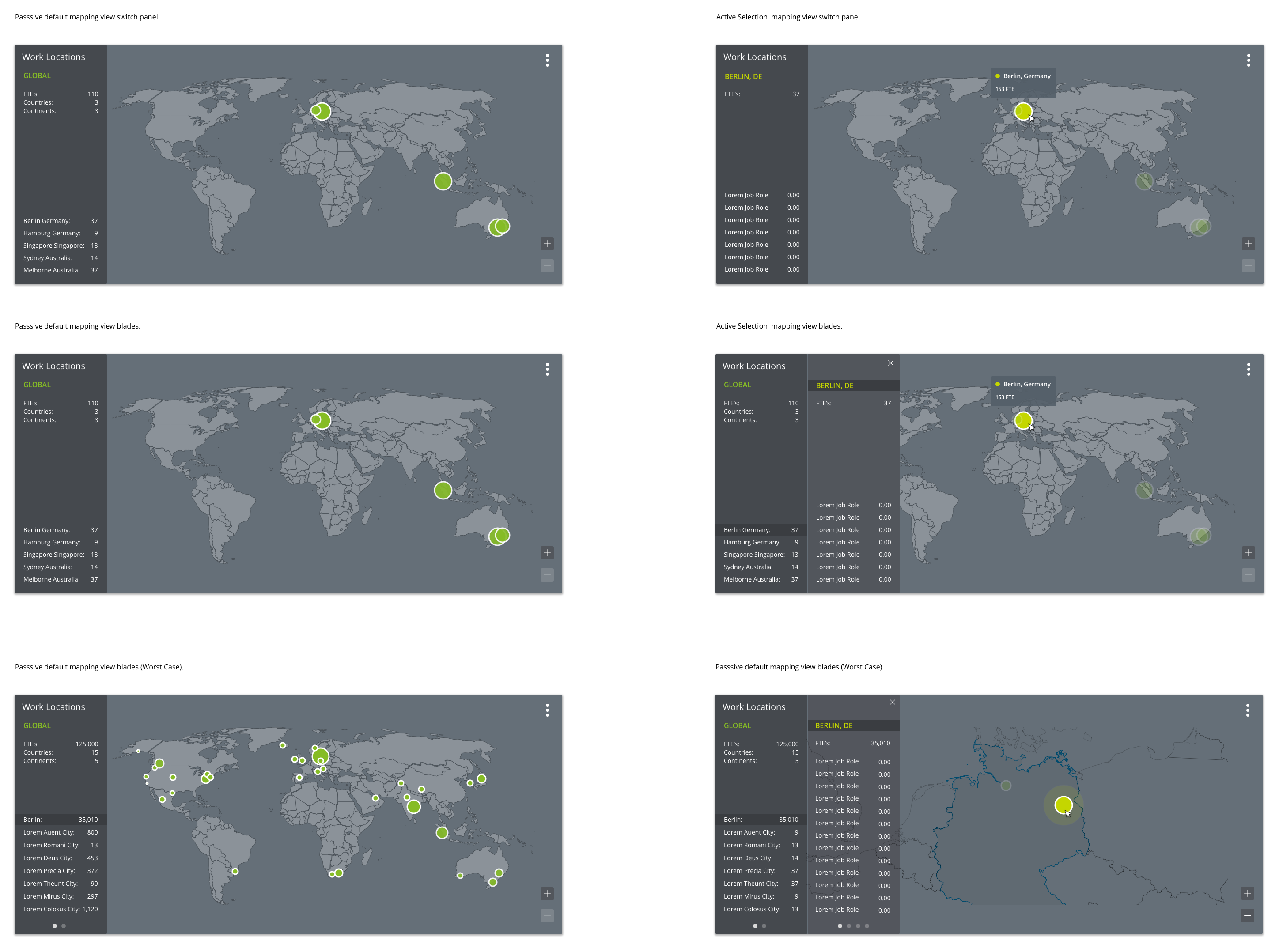
Map functionality artboards
Using Principle I built an animations to demonstrate how a user would interact with the mapping solution. This was also around the time I convinced the team that a darker themed map would be more impactful and easier to gain insights from. This demo was a bit quick and dirty but it helped the engineering team understand the nuances of the design intent.
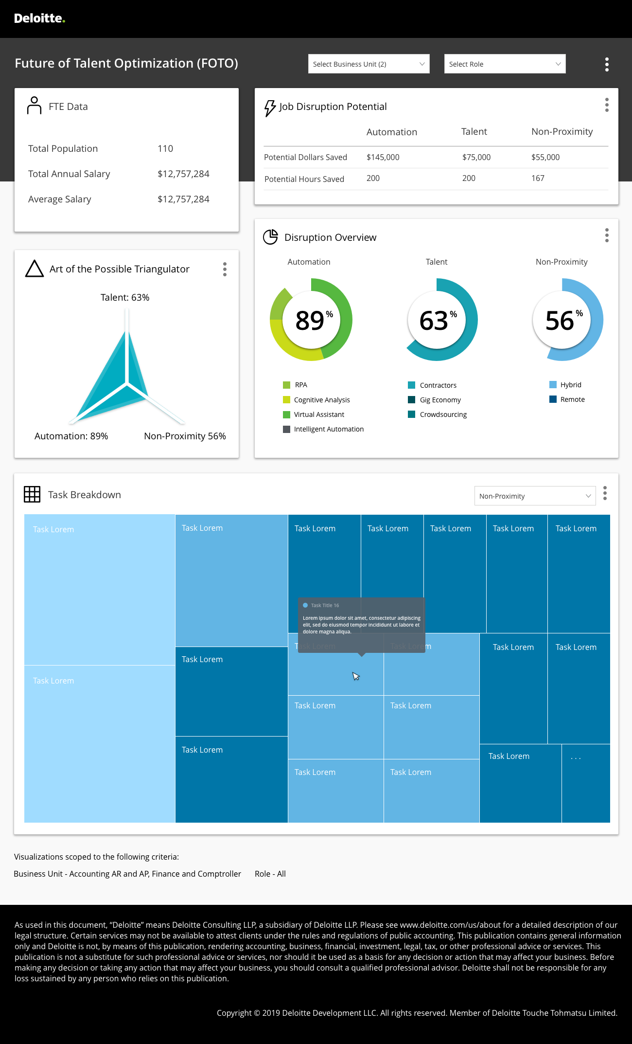
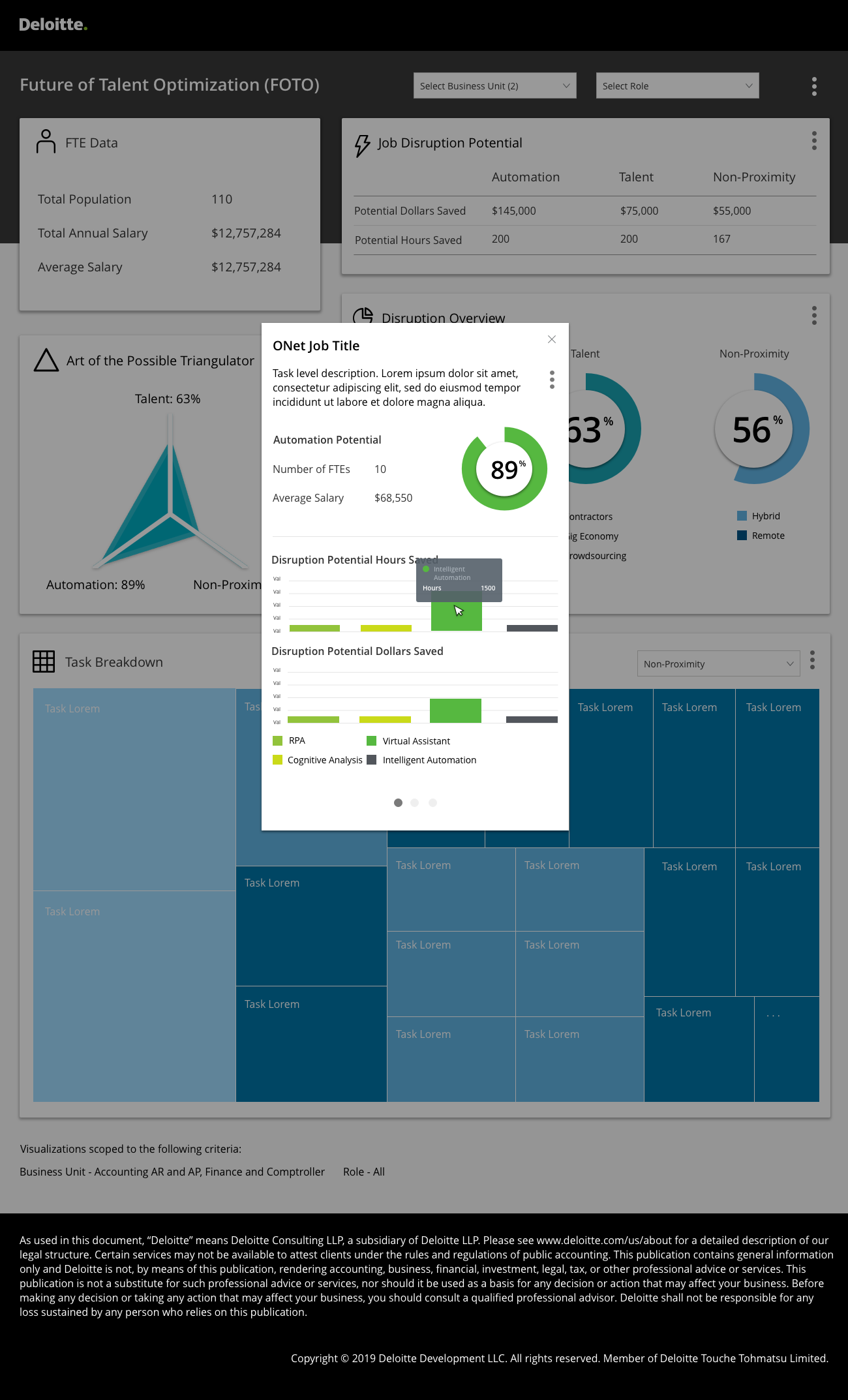
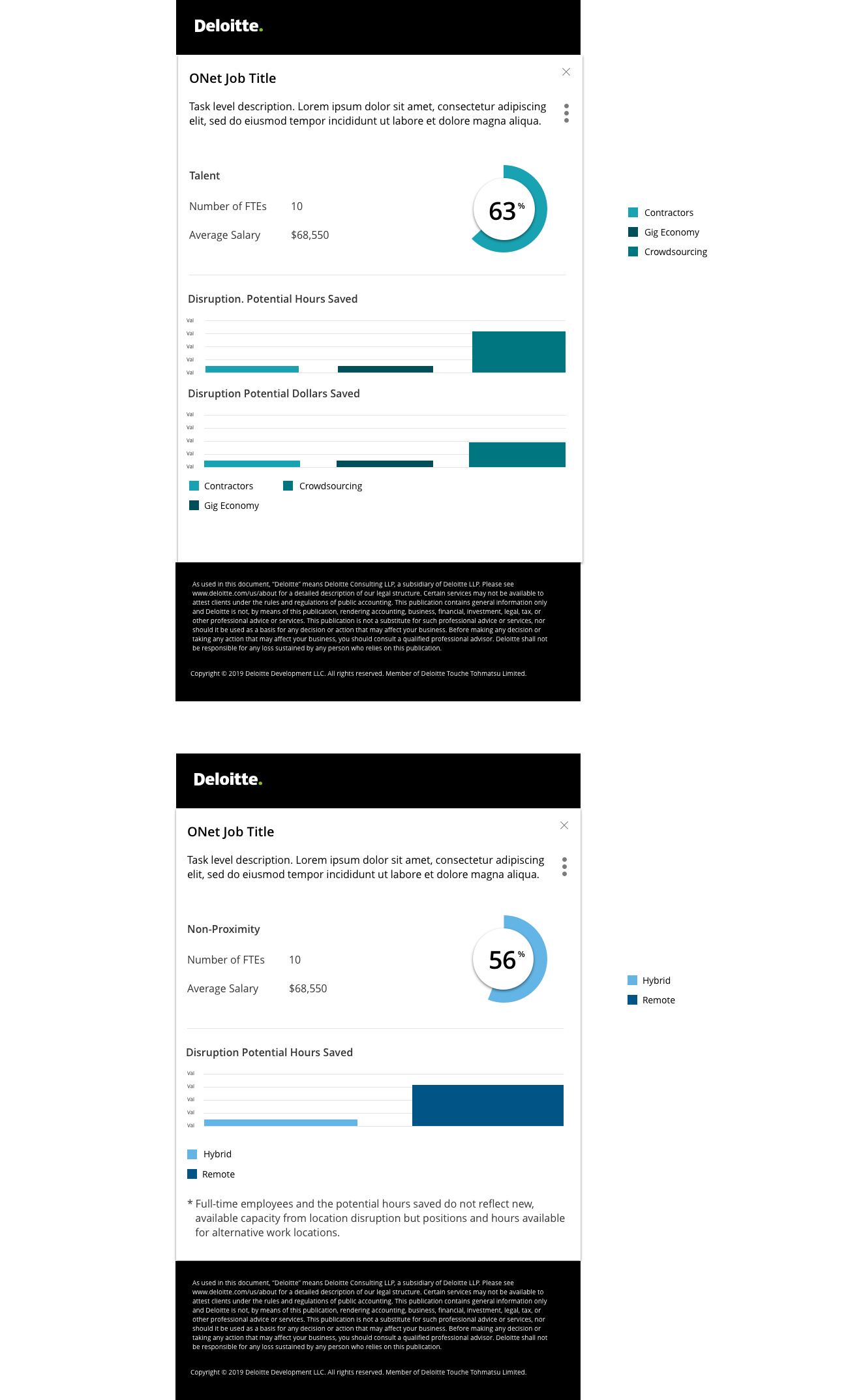
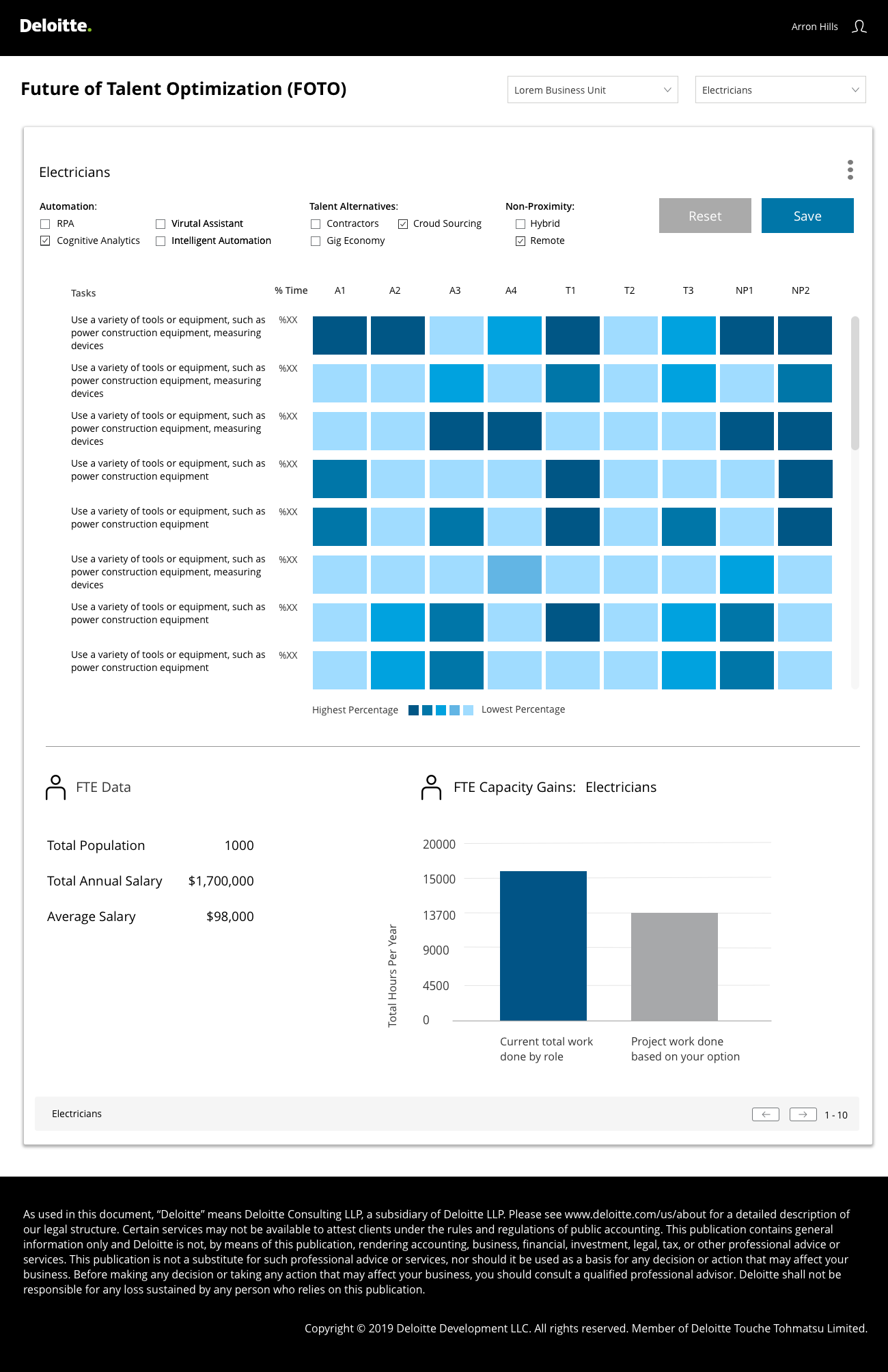
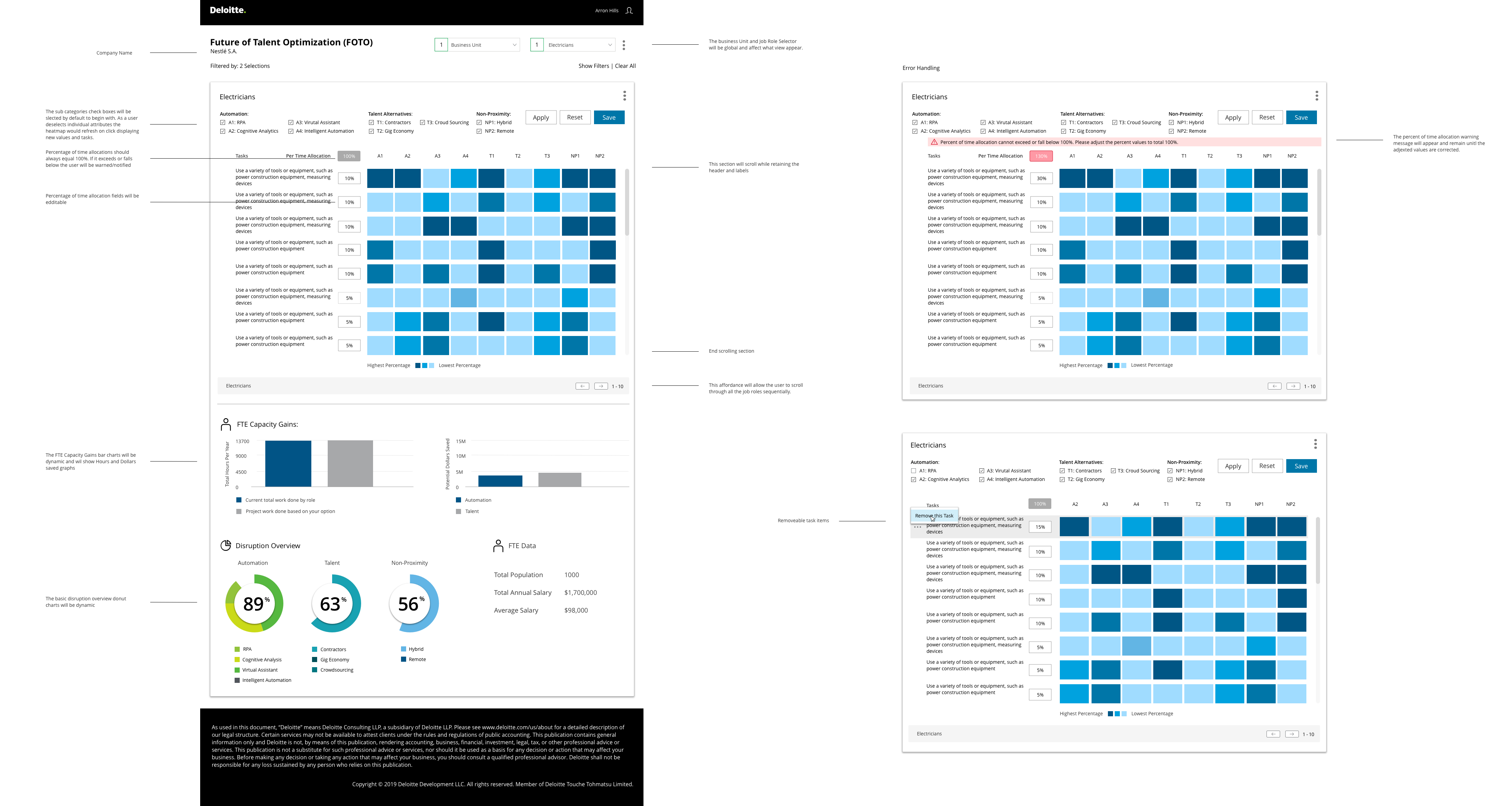
Workplace disruption is the measure of precisely which FTE roles within a given business unit can be converted or eliminated based on the application of automation, talent alternatives, and potential non-proximity solutions. This template needed to allow business unit and role selection.
Data from O*NET would then be interpolated into the template and presented in a simplified radar graph, donut charts and a heat map. Roles data needed to be displayed in modals which would detail granular data about role disruption.
The member advisors needed a better way to visualize work disruption. The requirements called for a way to toggle between disruptors, see changes reflected in real time, as well as the ability save instances of these views. This lead to a new interaction model as well as a way to show net capacity gains.
Several rounds of review with the member advisors and the data science team were required to ensure all of the elements were featured and displaying correctly when rendered. The relationship between the disruption categories and the output needed to be clear and also needed to be designed in a way that could support new features such as the ability to add (not just remove) tasks.

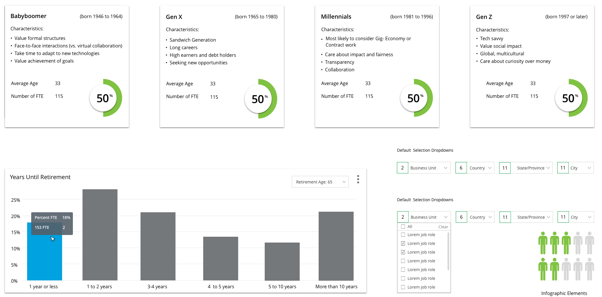 Template modules designed to support the Workplace Profiles.